

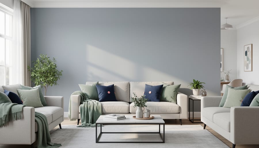
The right paint color pairing transforms a room instantly, and you don’t need a design degree to get it right. Classic combinations like soft gray with warm white, sage green with cream, or navy blue with blush create visual interest while maintaining balance. The key lies in understanding value contrast (how light or dark colors appear next to each other), temperature harmony (warm tones with warm, cool with cool, or strategic opposites), and the 60-30-10 rule: 60% dominant color, 30% secondary, 10% accent.
Most successful interior color schemes draw from one of three proven approaches: monochromatic (shades of a single color), analogous (neighbors on the color wheel), or complementary (opposites that energize each other). Your room’s natural light, existing furniture, and intended mood should guide your choice. North-facing rooms benefit from warmer palettes to counter cool daylight, while south-facing spaces can handle cooler tones without feeling stark.
This guide presents 20 tested paint combinations with specific application advice for different rooms and lighting conditions. You’ll find pairings for every style, from bold and modern to soft and traditional, plus practical tips on finishes, undertones, and budget-friendly testing methods. Whether you’re refreshing a single accent wall or reimagining your entire home, these combinations give you a confident starting point backed by color theory and real-world results from our design community.
How We Chose These Color Combinations
We didn’t just chase the latest Pinterest trends when curating these 20 combinations. Each pairing made the list through a rigorous selection process that prioritizes real-world results over fleeting fads. Our criteria mirror the tested home improvement strategies we recommend across Designers Raum: practical, proven, and accessible to everyone.
Here’s how we narrowed thousands of possibilities to these 20:
- Grounded in color theory, complementary and analogous schemes that create visual harmony
- Vetted by practicing interior designers with 10+ years of experience
- Tested in real homes by Designers Raum community members
- Versatile enough to work across different room types and sizes
- Achievable on various budgets, from DIY-friendly to statement investments
This multi-layered approach ensures you’re getting combinations that look beautiful in photos and actually work in lived-in spaces. We prioritized pairings that forgive imperfect lighting, complement common furniture finishes, and age gracefully as trends shift. These aren’t experimental, they’re reliable choices backed by both design principles and real homeowner feedback.
1. Warm White & Terracotta, Earthy Elegance
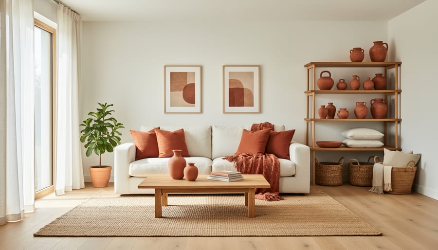
This pairing brings the warmth of Mediterranean villas into your home. Use warm white as your base color, covering roughly 70% of the space, and introduce terracotta as an accent on a feature wall, lower cabinets, or trim. The key is choosing a warm white with creamy or ivory undertones rather than cool, stark white, which would clash with terracotta’s earthy richness. This combination works especially well in living rooms and kitchens because it creates an instantly cozy, grounded atmosphere that encourages gathering and conversation. The terracotta adds depth and character without overwhelming the space, while the warm white keeps rooms feeling open and light-filled.
2. Navy Blue & Blush Pink, Modern Sophistication
Navy blue and blush pink create a striking partnership that feels both daring and refined. The deep, grounding navy provides gravitas while soft blush prevents the space from becoming too serious or masculine. This combination works beautifully in bedrooms, where navy walls with blush bedding create a cocoon-like retreat, and in home offices, where navy accent walls behind desks add authority without coldness.
The key to success is proportion: use navy as your dominant color (60-70%) on the largest wall or as a feature wall, then introduce blush through textiles, artwork, and smaller painted surfaces like built-ins or trim. If you’re hesitant about commitment, reverse the ratio, keep walls soft blush and bring navy through furniture and accessories. Metallic accents in brass or rose gold beautifully bridge these two tones, adding warmth and preventing the space from skewing too cool.
3. Sage Green & Cream, Calming Retreat
This nature-inspired pairing taps into our innate connection to the outdoors, making it particularly effective in spaces designed for rest and rejuvenation. Sage green’s muted, grayish undertone prevents it from feeling juvenile or overly bright, while cream adds warmth that keeps the room from turning cold or clinical.
The psychological benefits are well-documented: soft greens reduce stress, lower blood pressure, and promote mental clarity, exactly what you want in a bedroom or bathroom retreat. The cream component prevents the green from feeling too stark or hospital-like, creating an enveloping, cocoon-like atmosphere.
For depth and visual interest, layer multiple green tones. Use sage as your primary wall color, introduce a slightly deeper eucalyptus or moss shade on one accent wall or in built-ins, and bring in near-white pistachio tones through trim or ceiling paint. This tonal variation creates dimension without requiring additional colors, keeping the calming effect intact while preventing flatness.
4. Charcoal Gray & Mustard Yellow, Bold Contrast
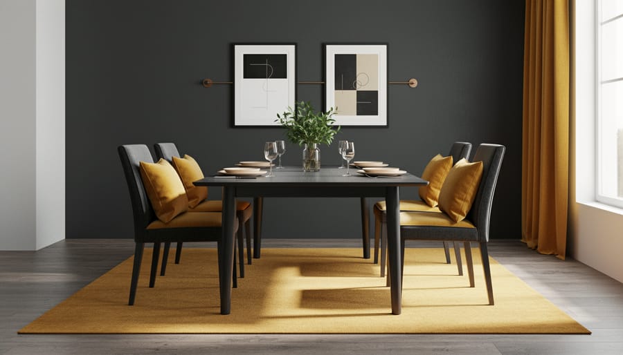
Charcoal gray and mustard yellow create one of the most dramatic color pairings available, perfect when you want a space that commands attention. This high-contrast combination works exceptionally well in dining rooms, entryways, and accent walls where you want to make a bold statement without overwhelming the entire home.
The key to success lies in proportion. Use charcoal gray as your dominant color (roughly 70% of the space) on three walls, then let mustard yellow shine as the accent (30%) on a feature wall or through painted trim and molding. This ratio prevents the yellow from becoming visually exhausting while maintaining its energizing effect.
Lighting plays a crucial role with this pairing. In rooms with abundant natural light, the mustard yellow will appear vibrant and cheerful throughout the day. In darker spaces, consider warm-toned artificial lighting to prevent the charcoal from feeling oppressive and to keep the yellow from looking muddy or dull.
5. Soft Gray & Pale Blue, Serene Simplicity
This universally flattering pairing ranks among the most forgiving color combinations for first-time painters. The gentle interplay between soft gray and pale blue delivers an instantly calming effect that translates beautifully across living rooms, bedrooms, nurseries, and even home offices.
The secret lies in their shared cool undertones, which visually recede rather than advance. This creates the illusion of more space and higher ceilings, making it ideal for smaller rooms or those with limited natural light. Use soft gray as your primary wall color (covering about 70% of surfaces) with pale blue on a single accent wall or in architectural details like built-in shelving.
The combination remains interesting without demanding attention, providing a serene backdrop that lets furniture and artwork shine. It pairs effortlessly with white trim, natural wood tones, and both warm and cool accent colors, giving you flexibility as your style evolves.
6. Olive Green & Burgundy, Rich Heritage
This timeless pairing evokes the refined elegance of traditional English manor homes and heritage interiors. Olive green brings natural, earthy depth while burgundy adds luxurious warmth, together they create spaces that feel both grounded and sophisticated.
The combination works best in libraries, studies, or formal living rooms where you want to encourage contemplation and conversation. Use olive as your dominant wall color with burgundy as an accent on a single feature wall, or reverse the ratio in smaller spaces to prevent them feeling too dark.
Wood tones are essential companions here. Warm walnut, cherry, or mahogany furniture naturally bridges these colors, while brass or bronze fixtures add complementary metallic notes. Consider olive walls with burgundy velvet upholstery, or burgundy accent walls behind dark wood bookshelves. The key is layering, add texture through woven textiles, leather-bound books, and patterned rugs to prevent the richness from feeling flat or heavy.
7. White & Black, Timeless Drama
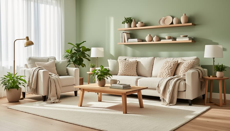
White and black creates instant visual impact through pure contrast. This pairing works beautifully in modern and minimalist spaces where clean lines matter, but it needs careful handling to avoid feeling sterile or unwelcoming.
The key is introducing warmth through texture and layering. Think plush textiles, natural wood furniture, woven baskets, or soft area rugs. These elements break up the severity while maintaining the crisp aesthetic. Metallic accents in brushed nickel or warm brass also add depth without compromising the monochrome palette.
Rather than splitting rooms 50/50, use white as your dominant color (walls, ceiling) with black as a grounding accent on trim, doors, or a single feature wall. This ratio prevents the space from feeling oppressive while preserving the dramatic effect that makes this combination so striking.
8. Peach & Teal, Playful Energy
This unexpected complementary pairing delivers instant visual interest without taking itself too seriously. Peach brings warmth and approachability, while teal adds sophistication and calm, together they create spaces that feel both energetic and balanced.
The key to success lies in proportion. Use teal as your dominant color on larger surfaces, with peach as strategic accents through textiles, artwork, or a single feature wall. This 70-30 split prevents the combination from overwhelming while maintaining its playful character.
This palette shines in creative spaces where personality matters, think kids’ playrooms, craft studios, or kitchens that embrace eclectic charm. Anchor the combination with crisp white trim and natural wood tones to ground the vibrancy and create breathing room between the colors.
9. Taupe & Soft Pink, Understated Warmth
Taupe and soft pink deliver warmth without the saccharine qualities some worry about when introducing blush tones. This pairing works because taupe, a sophisticated blend of gray and beige, grounds the pink, preventing it from skewing too sweet or juvenile. The result is a cozy, enveloping atmosphere that feels grown-up and refined.
This combination shines in bedrooms and sitting areas where relaxation is the priority. Use taupe as your dominant wall color (around 70% of surfaces) and introduce soft pink through accent walls, upholstered headboards, or drapery. The pink catches natural light beautifully, adding subtle dimension throughout the day without demanding attention.
For maximum impact, choose a taupe with warm undertones rather than cool gray-leaning versions, which can clash with pink’s warmth. Test samples next to your pink choice to ensure they harmonize rather than compete.
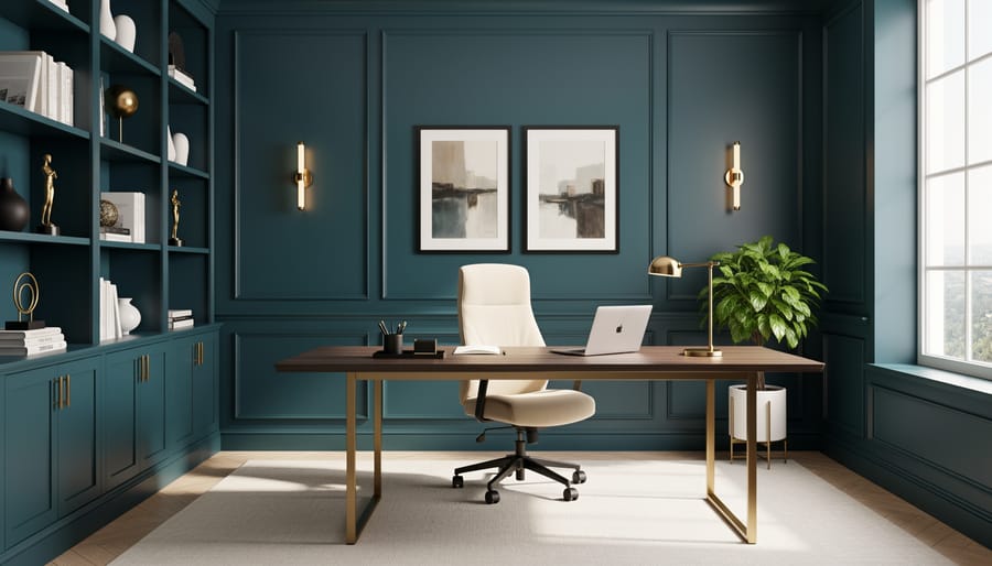
10. Deep Teal & Gold Accents, Luxurious Touch
Deep teal paired with gold accents delivers instant sophistication without the luxury price tag. This jewel-toned combination works beautifully as a feature wall in living rooms or dining areas, where the richness of teal creates depth while strategic gold touches, think picture frames, cabinet hardware, or light fixtures, add glamorous contrast.
The key to budget-friendly luxury lies in restraint. Paint one accent wall in deep teal and keep surrounding walls neutral, then introduce gold through affordable accessories rather than expensive finishes. Metallic gold spray paint can transform thrift-store finds into high-end accents. This approach concentrates visual impact where it matters most while keeping costs manageable.
For the teal, look for shades with blue-green balance rather than overly dark hues that might feel heavy. The gold accents catch and reflect light, making even modest spaces feel more expansive and refined.
11. Beige & Forest Green, Natural Harmony
This organic pairing taps into biophilic design, the principle that connecting with nature indoors improves wellbeing and reduces stress. Beige provides a warm, earthy foundation while forest green introduces the calming essence of woodland landscapes. The combination works exceptionally well in open-plan spaces where flow between rooms matters, as both colors carry visual weight without demanding attention.
In modern farmhouse interiors, use beige on main walls (think warm greige or sandy tones) and reserve forest green for accent walls, cabinetry, or built-in shelving. The pairing naturally complements natural wood finishes, stone countertops, and linen textiles. For smaller spaces, flip the ratio, forest green on a single feature wall with beige surrounding it prevents the room from feeling closed in while still delivering that coveted connection to nature.
12. Lavender & Gray, Soft Sophistication
Lavender and gray form a soothing partnership that feels both calming and current, ideal for bedrooms where you want a restful atmosphere or powder rooms that benefit from a touch of gentle color. The key to making this combination work is selecting a lavender with gray undertones rather than one that leans purple or pink. Dusty lavender shades pair seamlessly with mid-tone grays, creating a cohesive look that avoids feeling too sweet or juvenile. Use lavender on walls and gray on trim, or reverse the ratio for subtler effect. This pairing is among the most forgiving smart interior updates for anyone hesitant about color, since both hues read as neutrals from a distance yet add personality up close.
13. Chocolate Brown & Cream, Warm Classic
Chocolate brown and cream is the design equivalent of a perfectly worn leather armchair, comfortable, inviting, and timeless. This pairing creates cozy, grounded spaces that feel both sophisticated and approachable, making it ideal for dens, bedrooms, and traditional interiors where you want people to settle in and stay awhile.
The key to keeping this classic combination from feeling dated lies in your proportions and textures. Use cream as your dominant color (walls, larger surfaces) with chocolate brown as a rich accent on one feature wall, window treatments, or furnishings. This reversal of the heavy-light balance prevents the room from feeling dark or closed-in. Layer different textures within both colors: a cream linen sofa, chocolate velvet pillows, woven cream throws, and glossy brown picture frames. These varied surfaces catch light differently and add contemporary visual interest.
Incorporate modern elements to bridge past and present. Clean-lined furniture, geometric patterns in rugs or artwork, and metallic accents in brass or brushed gold keep the palette feeling current rather than stuffy. Consider a warmer cream with slight yellow undertones rather than a stark white-cream, which creates better harmony with chocolate brown and enhances that cozy, enveloping atmosphere this combination does so beautifully.
14. Coral & Navy, Coastal Confidence
Coral brings sunny warmth while navy grounds this combination with sophistication, a pairing that feels instantly coastal without leaning into literal beach clichés. The secret lies in proportion: use navy as your dominant wall color (roughly 60-70% of the space) and coral as energizing accents through trim, built-ins, or a single feature wall. This reverses the typical “light walls, dark accents” rule and creates dramatic depth that flatters both formal dining rooms and busy family spaces.
The combination works year-round because coral’s pink-orange undertones add cheerfulness in winter while navy keeps it from feeling too sweet or summery. Consider matte navy for walls to absorb light and create richness, paired with satin coral on woodwork for subtle sheen. If committing to full walls feels daunting, start with budget-friendly upgrades like painting existing furniture navy and adding coral cushions, artwork, or lampshades to test the palette’s energy in your space.
15. Greige & Charcoal, Modern Neutral
Greige, that perfect gray-beige hybrid, paired with charcoal creates a sophisticated neutral foundation that anchors modern interiors without feeling cold or sterile. This combination works exceptionally well in open-concept spaces where you need visual flow between areas. Use greige on main walls (about 70%) with charcoal as an accent on a feature wall, kitchen island, or architectural details like built-in shelving.
The key to preventing this palette from feeling flat is layering textures throughout the space. Mix matte and glossy finishes, incorporate natural materials like linen curtains, wool throws, and raw wood furniture. The subtle contrast between greige and charcoal provides just enough definition to create zones in open layouts while maintaining a cohesive, uncluttered aesthetic that minimalist design lovers appreciate.
16. Mint Green & Peach, Retro Refresh
This vintage-inspired combination channels mid-century charm while feeling decidedly current and cheerful. Mint green brings coolness and clarity, while peach adds warmth and approachability, creating a balanced palette that energizes without overwhelming.
The key to avoiding a kitschy, dated look lies in proportion and shade selection. Choose muted, sophisticated versions rather than saturated pastels, think dusty mint paired with soft coral-peach instead of bright Easter egg tones. Use mint as your dominant color (60%) on walls, with peach as thoughtful accents in textiles, artwork, or a single feature element like kitchen cabinets or bathroom vanity.
This pairing excels in kitchens where the combination feels naturally at home, bathrooms that benefit from the fresh, clean vibe, and eclectic spaces where playful color is welcomed. Ground the palette with natural materials like light wood, rattan, or brass fixtures to add contemporary sophistication. White trim and neutral flooring prevent the space from feeling themed or costume-like, keeping the focus on that optimistic, retro-fresh energy.
17. Warm Gray & Terracotta, Southwestern Warmth
This desert-inspired pairing brings the warmth of clay earth against cool, sophisticated neutrals, perfect for creating spaces that feel both grounded and refined. Warm gray anchors the room as your primary wall color, while terracotta works beautifully as an accent on a single feature wall or in textured elements like exposed brick or decorative plaster. The combination naturally complements natural materials: think raw wood beams, woven jute rugs, leather furniture, and stone accents. It’s particularly effective in living rooms with large windows or spaces that open onto patios, where the palette echoes outdoor desert tones. For those planning broader updates, these colors integrate seamlessly with practical renovation tips like updating flooring or adding architectural details, as the neutral base provides flexibility for future changes while the terracotta adds character without commitment.
18. Dusty Blue & Ivory, Elegant Simplicity
Dusty blue paired with ivory creates a refined, tranquil atmosphere that feels both timeless and gently romantic. This combination works exceptionally well in master bedrooms, where the muted blue tone promotes relaxation without the coolness of brighter blues, while ivory adds warmth and prevents the space from feeling cold or sterile.
The light-enhancing quality of this pairing makes it particularly valuable in north-facing rooms or spaces with limited natural light. Ivory reflects available light beautifully, and dusty blue’s soft gray undertones prevent harsh contrast that can make rooms feel smaller. Use dusty blue on three walls with ivory as an accent wall behind the bed, or reverse the ratio in formal dining rooms where you want more brightness.
This palette pairs naturally with brass fixtures, linen textures, and warm wood tones. The key is choosing a dusty blue with balanced undertones, not too purple, not too gray, which creates that serene, elegant simplicity that ages gracefully.
19. Black & Warm White, Contemporary Edge
Black paired with warm white delivers all the sophistication of monochrome without the coldness of pure white. This contemporary combination works brilliantly for creating architectural definition, think black window frames against warm white walls, dark door trim, or painted ceiling beams. The warm undertones in the white (cream or ivory notes) soften the contrast just enough to feel inviting rather than stark.
This pairing excels in spaces where you want to highlight structural features. Black defines and grounds, while warm white prevents the drama from tipping into severity. It’s particularly effective in modern farmhouse, Scandinavian, and industrial interiors. Use black sparingly, 5-10% of the room, on trim, built-ins, or a single accent wall. The warm white does the heavy lifting on main surfaces, keeping rooms bright and airy while the black punctuates with intentional boldness.
20. Butter Yellow & Soft Gray, Cheerful Balance
Butter yellow paired with soft gray delivers an instant mood lift without the intensity of bolder yellows. This combination works beautifully in spaces where you want to encourage productivity and optimism, think home offices bathed in morning light or breakfast nooks that set a positive tone for the day. The gray grounds the yellow’s cheerfulness, preventing it from feeling juvenile or overpowering.
Use butter yellow on the main walls (a shade with cream undertones rather than acidic lemon) and introduce soft gray on trim, cabinetry, or a single accent wall. In kitchens, this pairing complements stainless steel appliances and white countertops while adding character that pure white lacks. The psychological benefits are notable: yellow stimulates mental activity and creativity, making it ideal for workspaces, while gray’s neutrality keeps you focused rather than distracted.
This combination is forgiving with lighting, it brightens north-facing rooms that lack natural warmth yet doesn’t overwhelm sun-drenched spaces. If you’re ready to transform your space with color but worry about commitment, start with butter yellow on a single feature wall and layer in gray through furnishings and accessories before painting additional surfaces.
Tips for Applying Color Combinations Successfully
Bringing paint color combinations to life requires more than picking pretty swatches. The 60-30-10 rule gives you a foolproof formula: use your dominant color for 60% of the room (usually walls), your secondary color for 30% (upholstery, curtains, larger accents), and your accent color for the remaining 10% (pillows, artwork, accessories). This proportion creates visual harmony without overwhelming the senses.
Paint large sample squares (at least 2×2 feet) directly on your walls and live with them for several days. Notice how they change as sunlight moves through your space and how they look under your lamps at night. What seems perfect at the paint store might read completely different in your home’s unique lighting.
Invest in quality painter’s tape for crisp, professional-looking lines where colors meet. Press the tape edge firmly with a credit card or putty knife to prevent bleeding, and remove it while the paint is still slightly tacky for the cleanest results.
If you’re nervous about commitment, start small. Paint a powder room, an accent wall, or even just built-in shelving. Sarah M., a Designers Raum community member, transformed her entire home one accent wall at a time: “I tested navy and blush in my office nook first. That small win gave me confidence to tackle the whole bedroom.” Beginning with manageable projects builds your skills and trust in the process.
Choosing the Right Finish for Each Color
Paint finish isn’t just about sheen, it fundamentally changes how your chosen colors appear and perform in a space.
Matte finishes absorb light, making colors look richer and deeper. They’re perfect for hiding wall imperfections and work beautifully with dark, moody shades like navy or charcoal in low-traffic areas. The downside? They’re harder to clean, so skip them in kitchens or hallways.
Eggshell offers a subtle glow that enhances soft neutrals like greige, warm white, and cream. It’s the go-to for living rooms and bedrooms, durable enough to wipe down yet forgiving on surfaces.
Satin provides a gentle sheen that makes lighter colors appear more luminous. Use it for high-traffic spaces and trim work, especially with pastels and mid-tone grays that benefit from the light reflection.
Semi-gloss and gloss finishes intensify color saturation and are essential for areas needing frequent cleaning, think kitchen cabinets, bathroom walls, and doors. They make bold colors like teal or mustard yellow pop dramatically but will highlight every surface flaw.
Budget-Friendly Implementation Ideas
You don’t need deep pockets to execute these color combinations beautifully. Start with accent walls, painting just one wall in a bolder shade uses less paint and creates impact without overwhelming your budget or commitment. A single gallon typically covers 350-400 square feet, so one wall might cost $30-50 versus $150+ for an entire room.
Carry the same combination through multiple spaces for cohesion and practical savings. Leftover paint from your living room terracotta can accent your hallway, eliminating waste and creating flow. Buy larger quantities upfront when possible; a five-gallon bucket costs significantly less per gallon than individual cans.
DIY painting saves hundreds in labor costs. Most of these combinations work perfectly for beginners, clean lines between two colors are easier to achieve than complex techniques. Invest in quality brushes and roller covers (they genuinely make application smoother), but save by using basic primer for most projects.
Splurge on high-traffic areas like kitchens and hallways where durability matters. Save with builder-grade paint in low-use spaces like guest bedrooms. Beautiful, transformative design absolutely fits real-world budgets.
Common Questions About Interior Paint Color Combinations
Choosing paint color combinations can feel overwhelming, especially if you’re working with existing furniture, uncertain about proportions, or worried about making permanent mistakes. These questions come up constantly in our Designers Raum community, so let’s address the most common concerns to help you move forward with confidence.
How do I know which color should be dominant?
Follow the 60-30-10 rule: your dominant color covers about 60% of the room (usually walls), the secondary color takes 30% (furniture, larger accents), and the accent color appears in 10% (accessories, pillows, artwork). The dominant color should be the one you can live with long-term.
Can I use these combinations with my existing furniture?
Absolutely. Neutrals like cream, gray, and white work with almost any furniture, while bolder pairings can highlight or complement existing pieces. Take photos of your furniture and test paint swatches against them in natural light to see what harmonizes.
What if I make a mistake and hate the color?
Paint is one of the most forgiving design elements because it’s relatively easy and affordable to change. Live with it for at least a week in different lighting conditions before deciding, as colors shift throughout the day.
Should I paint trim a different color from the walls?
Contrasting trim (typically white or cream) creates architectural definition and makes rooms feel more polished, while matching trim to walls creates a seamless, modern look that can make small spaces feel larger. Both approaches work, it depends on your style preference.
How long should I wait before repainting if I change my mind?
While paint is technically dry within hours, wait at least two weeks for it to fully cure before repainting. This gives you time to see the color in various lighting conditions and ensures proper adhesion for the new coat.
Remember that most color “mistakes” aren’t actually mistakes, just adjustments needed in lighting, proportion, or styling. Our community has seen countless transformations where an initial “wrong” choice became perfect once the room came together with furniture and accessories.
You’ve now got 20 proven paint color combinations that can completely transform your home, regardless of your budget or experience level. The beauty of paint is that it’s one of the most accessible, high-impact design tools available. If you’re feeling uncertain, start with just one room or even a single accent wall. Trust your instincts and remember that paint is forgiving, you can always adjust if something doesn’t feel right.
We’d love to see how these combinations come to life in your space. Share your before-and-after photos with the Designers Raum community, ask questions, and inspire fellow design enthusiasts who are on their own color journey. Your unique perspective and real-world results help everyone make better, more confident design choices. Which combination will you try first?
Comment here